
This project aimed at creating a seamless onboarding experience for students attending the Eden Food For Change cooking program.
Role: UX/UI Designer and Researcher
Team: 5 Designers
Client: Eden Food For Change
Contributions: Site visits, Stakeholder interviews, Personas, Journey Map, Sketches, Wireframes, Prototypes, and Mockups
Timeline: 4 months
A Bit About The Project
The organization- Eden Food for Change, a food bank in Western Mississauga, is dedicated to promoting healthy eating by developing food skills and empowering the community through education, outreach, and advocacy.
Our project was divided into three phases: Pre-registration, Registration, and Post-registration.
My team was responsible for the Post-registration phase, where we designed an intuitive onboarding process for students. This included step-by-step modules and easily accessible resources, with the main goal of helping users effectively understand and navigate the product.
——— The Problem
Integrating cooking students into the new cooking program without a pre-existing onboarding system, knowing there might be language barriers, limited technology knowledge and access to tech devices (ie computers).
1
2
5
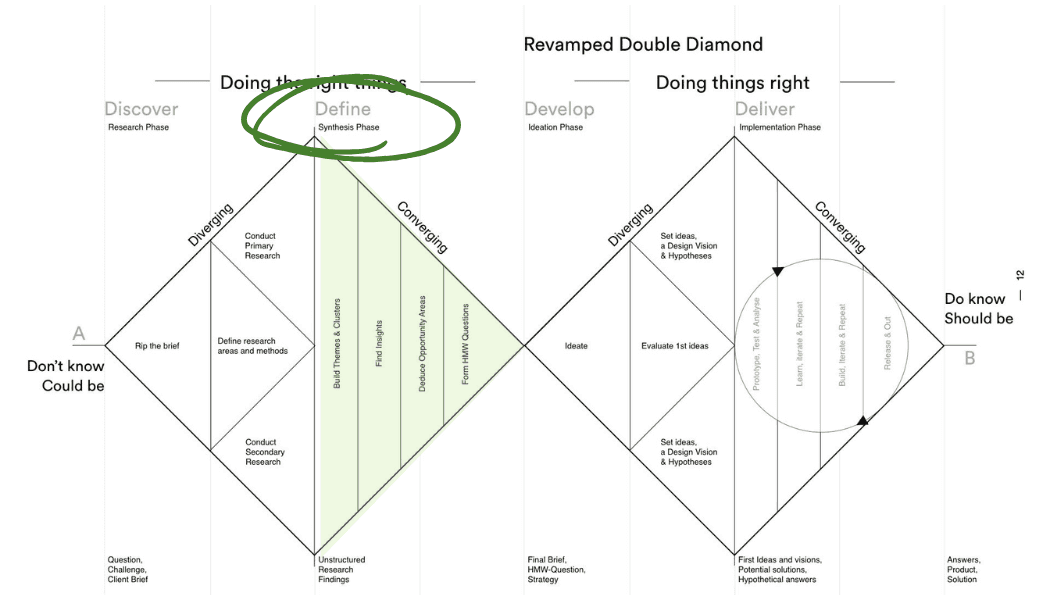
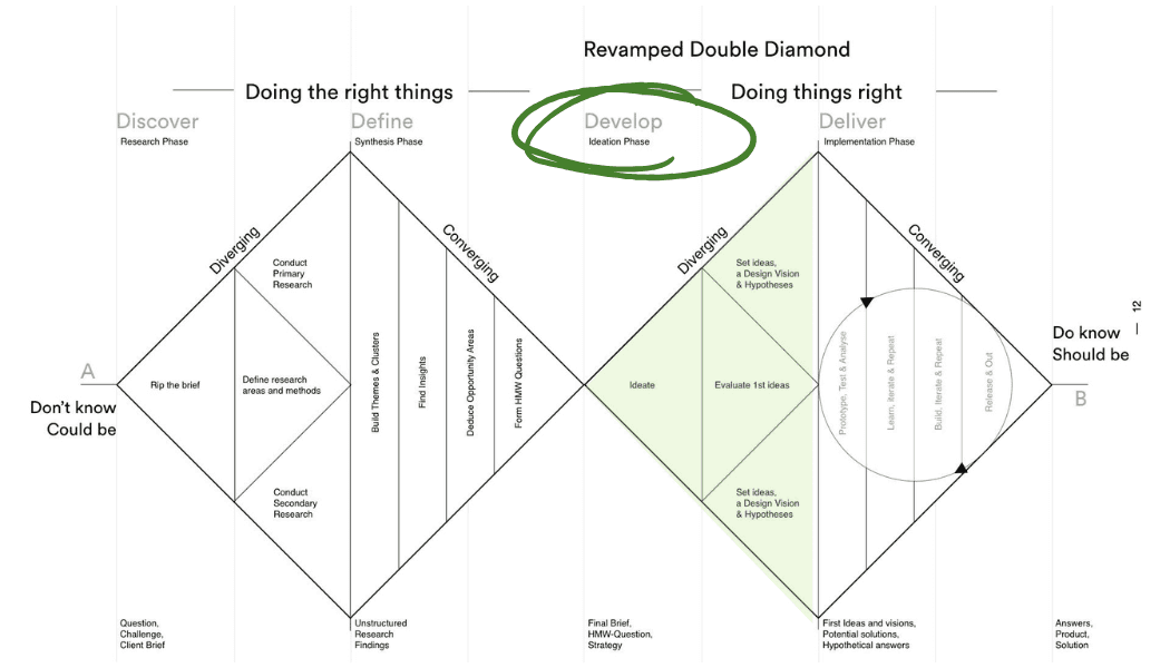
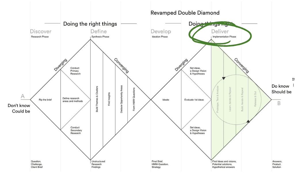
Following The Diamond Method
Discover (Learning About Eden)


The Research Stage Breakdown
1. Site Visit
We immersed ourselves in the environment to better understand the community and the organization.
1a. Talks and Discussions
We met with the head chef and learnt about the cooking program, the topics and the delivery. He told us about his goals for the program, which included creating a space that welcomed people who might not know how to cook but had a "spark" to learn. Also, he wanted this program to serve as a gateway into the culinary industry for the students. We were also informed that most students in the program had limited access to technology and tech knowledge.
We also learnt that the program would have asynchronous and synchronous elements. Students would need to watch videos by Chef Chris posted to YouTube (e.g dicing an onion) and take a skill test on the content (e.g dicing the onion in class).
2. Stakeholder Interview
We followed up the site visit with an online interview with the organization's director, who told us more about the organization and any current constraints they faced with the onboarding process. These constraints mainly revolved around technology but also included student outreach and recruitment. However, these constraints offered us a framework to work within (the pre-existing tech devices they used and started to paint a picture of the user).
3. Competitive Analysis
We conducted a competitive analysis of Eden's website to compare it to the other organizations that offer similar programs to their communities.
4. Heuristic Evaluation
By doing the analysis, we understood how the program registration information was presented and identified areas of opportunity for the onboarding system.
Define (Identifying The Problem Statement)
What We Found
With the prompt, we analyzed the users' potential barriers to better understand their journey. These barriers included:
• Demographics
• Future onboarding
• Barriers to access
• Upcoming program
Analyzing the information and the existing constraints, we decided not to make the process complicated. Seeing as the target audience had novice technology knowledge, we chose to highlight features and content from competitors to enhance the onboarding process.
Again, to align with Eden's goals, we focused on the following key considerations:
1. Accessibility
Ensuring user-friendly registration and content access.
2. Clarity of instructions
Ensuring information is straightforward/ to the point.
3. Learnability
Creating an onboarding process that simplifies program management and allows for a smooth program integration.
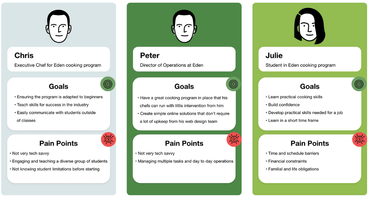
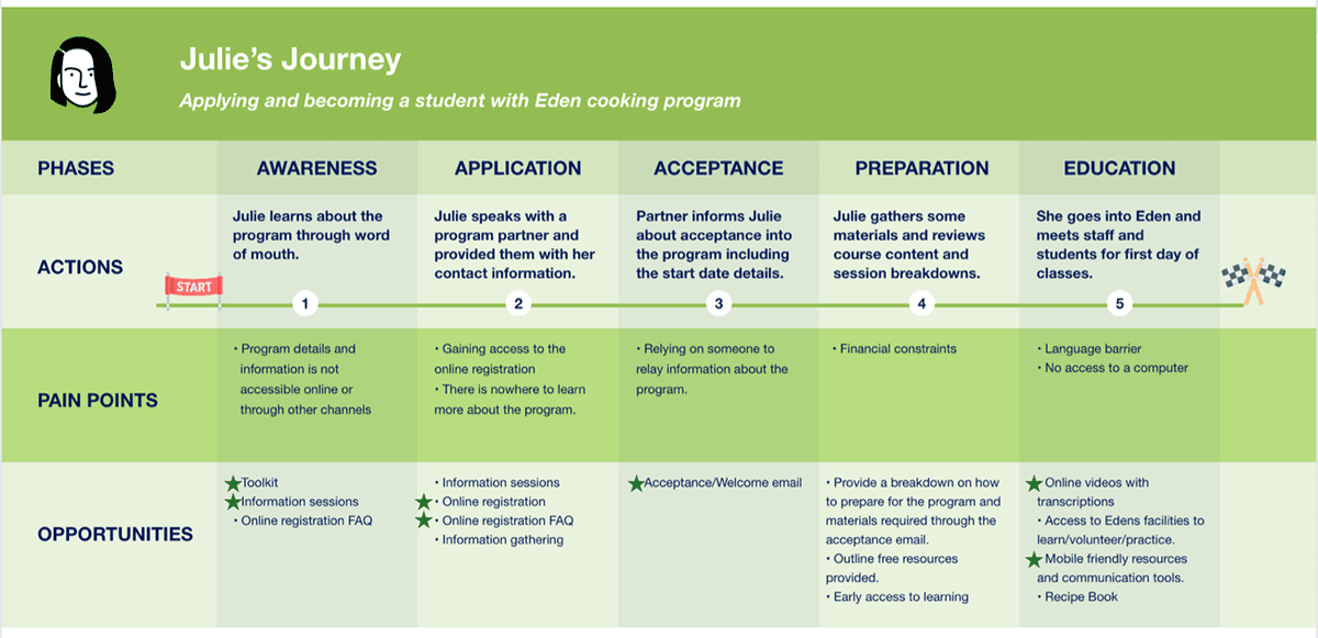
Personas and Journey Map
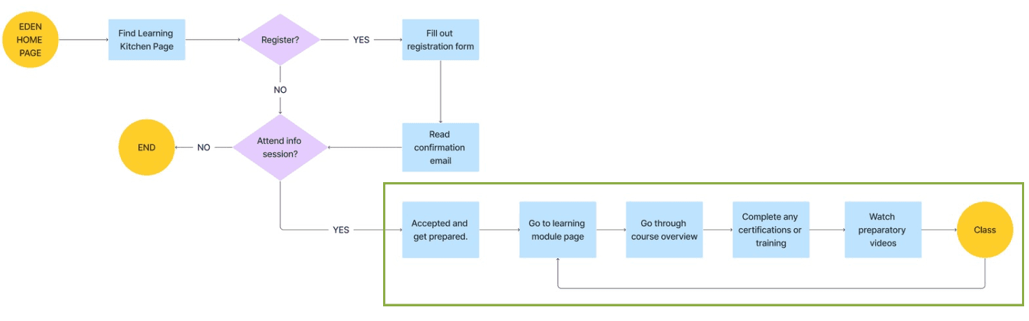
User Flow
User Flow Breakdown
After being accepted into the program, the student would:
- access a general learning module page
- review the course overview page to understand upcoming content and prepare for the program
- complete required certifications and training
- engage with preparatory videos and lessons to ensure readiness before starting in-person classes
Sketches & Wireframes

At this stage, we knew the problem, our constraints, and areas of opportunity; we had all the information we needed to move on to the layout and function of the design. We created sketches to map out the layout and content for the pages. We also decided to focus on mobile view only since we knew there might be limitations on what technology the user had access to, but having a phone was a program requirement.
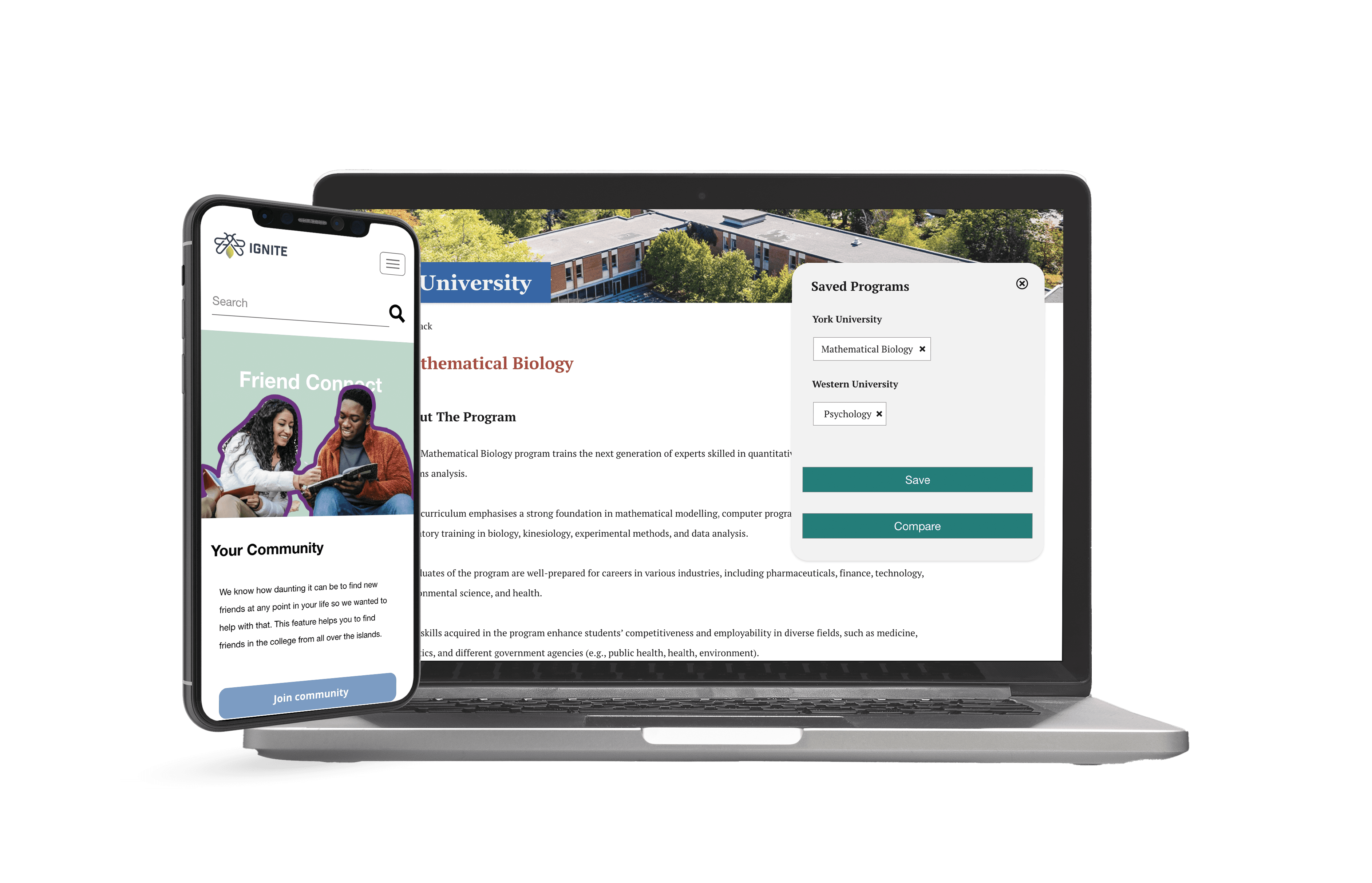
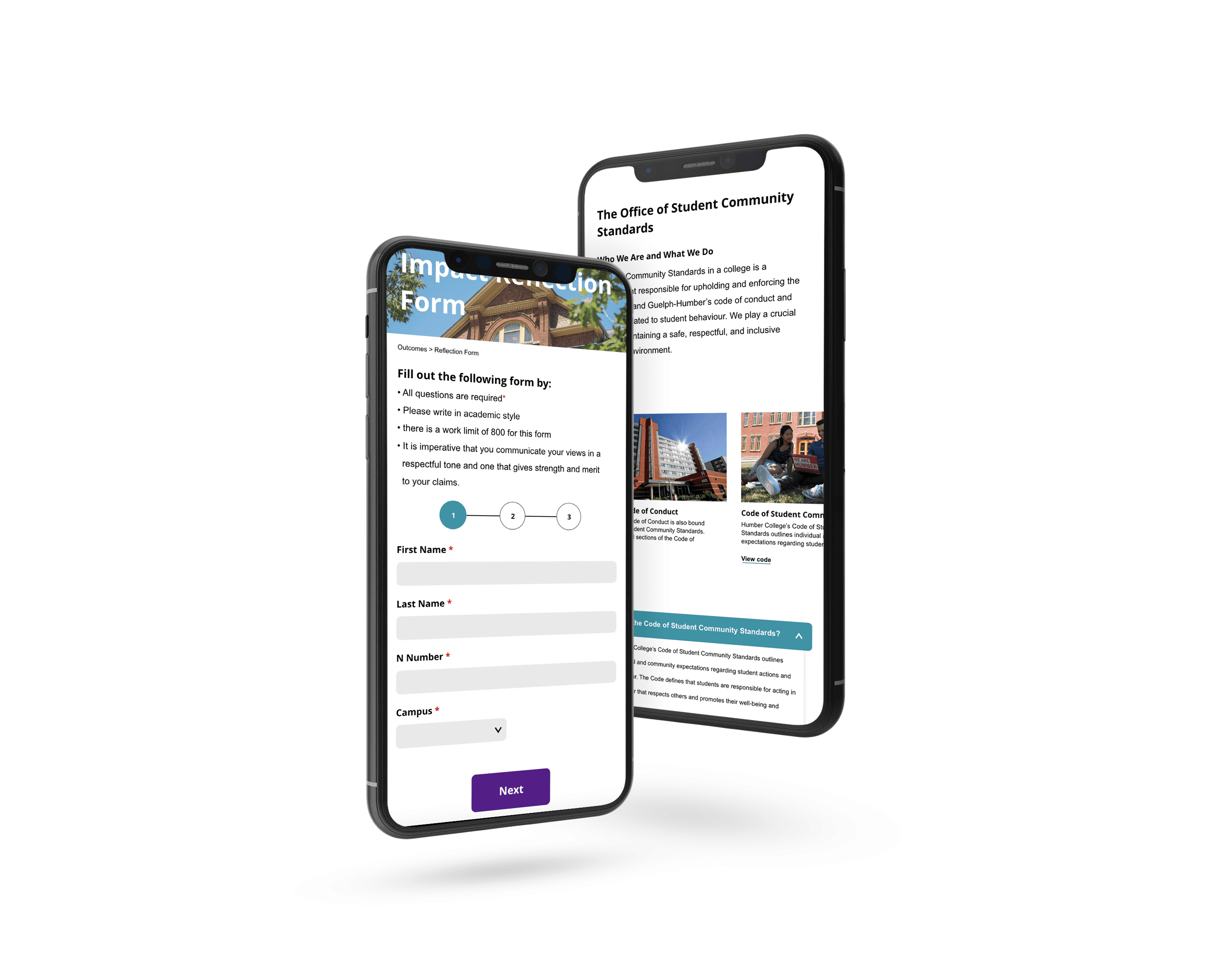
Final Mockups


Prototype Video
Measures of Success
There were no quantifiable metrics, but final presentations were held with the Executive Director. Not knowing much about UX and the design process, my team and I used limited design jargon and explained the processes that got us to the final designs. By the end of the presentation, the director was excited by what he was shown and by the work we had put into it. He gave final remarks, saying that he would try to implement the designs, but more than that, he would walk away knowing and understanding the steps that led to the final designs.
Takeaways
By the end, my team and I were very happy with the solutions and final designs we created. From not knowing where to start to coming to the end, what helped us the most was the research. It helped us plan out what we should do and aim for. If there was anything I would do differently, it would be to have more check-in sessions with the organization's director to update them at every stage and get feedback from them as we progressed.
Up Next: Know The Code

Thanks for stopping by!