
Know The Code
Role: UX/UI Designer and Researcher
Team: 3 Designers, 1 Developer
Client: Humber College- Know The Code Department
Contributions: Stakeholder Interviews, Card Sort, Heuristic Evaluation, Information Architecture, Personas, Journey Map, Sketches, Wireframes, Prototypes, Mockups
Timeline: 1 month
About The Site
The Office of Student Community Standards website, Know the Code (https://humber.ca/knowthecode/), is the online resource and accessibility destination for all information and immediate contact with the people keeping the Humber community safe. Essentially, it is a space to keep updated on all the codes and regulations in the school and resolve disciplinary issues.
The Problem
This site is a one-stop shop for students to get information on the codes and regulations for the school. Understandably, that would mean a lot of information needs to be covered, and because of this, there was an overload of information on the site that made it difficult to locate specific information. Also, some information was hidden within the navigation, through links and within breadcrumbs, which would force the user to search deeply for the information they might need, which could lead to errors, abandonment and frustration. Our aim was then to find the best solutions that targeted these problems and implement them in the redesign.
There was also a hard deadline of 1 month before solutions needed to be presented to stakeholders.
How we wanted to tackle the project
1
2
Uncover the problems
3
Create a new sitemap (organize content)
Meeting The Stakeholders
Before anything started, our group met with the stakeholders (Office of Student Community Standards administrators). During this meeting, we were told a bit about the department itself, the resources and the capacity they were used in. They also spoke about their target audience and what they wanted from this project. their target audience and their expected outcomes by the end of the project.
A quick summary
Resource - to help inform students about the different codes within the school and resources to use if codes are broken.
Capacity - responsive but mainly used by students on the go (mobile mostly)
Target Audience- students, faculty
Expected Outcomes- the amount of information given on certain pages is reduced, and final designs can be implemented into the current site.
Evaluating The Site
With the deadline in mind, we moved pretty quickly with background research. Since this was a redesign, the first thing we wanted to do was go through the site. Even though we had gotten a list of problems during the meeting, we still wanted to go through everything ourselves and understand what was there.
While on the site, we saw the problems that needed addressing from a design perspective (usability, layout, content grouping) and just made quick notes of everything.
Things Noted
Content is categorized well
Each code selected opens to a new page
A lot of information is given at once ( a bit overwhelming)
Forms were difficult to find (seemed hidden within all the codes)
Outdated design formats (visual principles, consistency, visual stimuli)
Did not address UX principles (cognitive load, peak-end-rule etc.)
The site functioned differently from Humber College's main site
Pages were not very responsive


Going Deeper
So we started to see the problems that needed solving, but we still wanted to do some more initial research to see exactly where the problems were, where users might abandon the site, and overall, to better understand the site.
Heuristic Evaluation
Once we'd gotten an idea of the site, we moved into the discovery phase to fully understand the site and discover any areas of concern. We based this evaluation on two tasks:
Completing a form
Accessing original code documents
Card Sorting
We uncovered the problems and focused on specific areas of the site to redesign, and as designers having gone through the site, we knew how it would function and its layout. What we needed to know was how the target audience used the site, which took us to the card-sorting session. This was an opportunity to understand how users might categorize the site's content and their understanding of the titles.
Key Takeaways
There was a lot of content that seemed redundant
Groupings were similar to the original site
Some labels were confusing
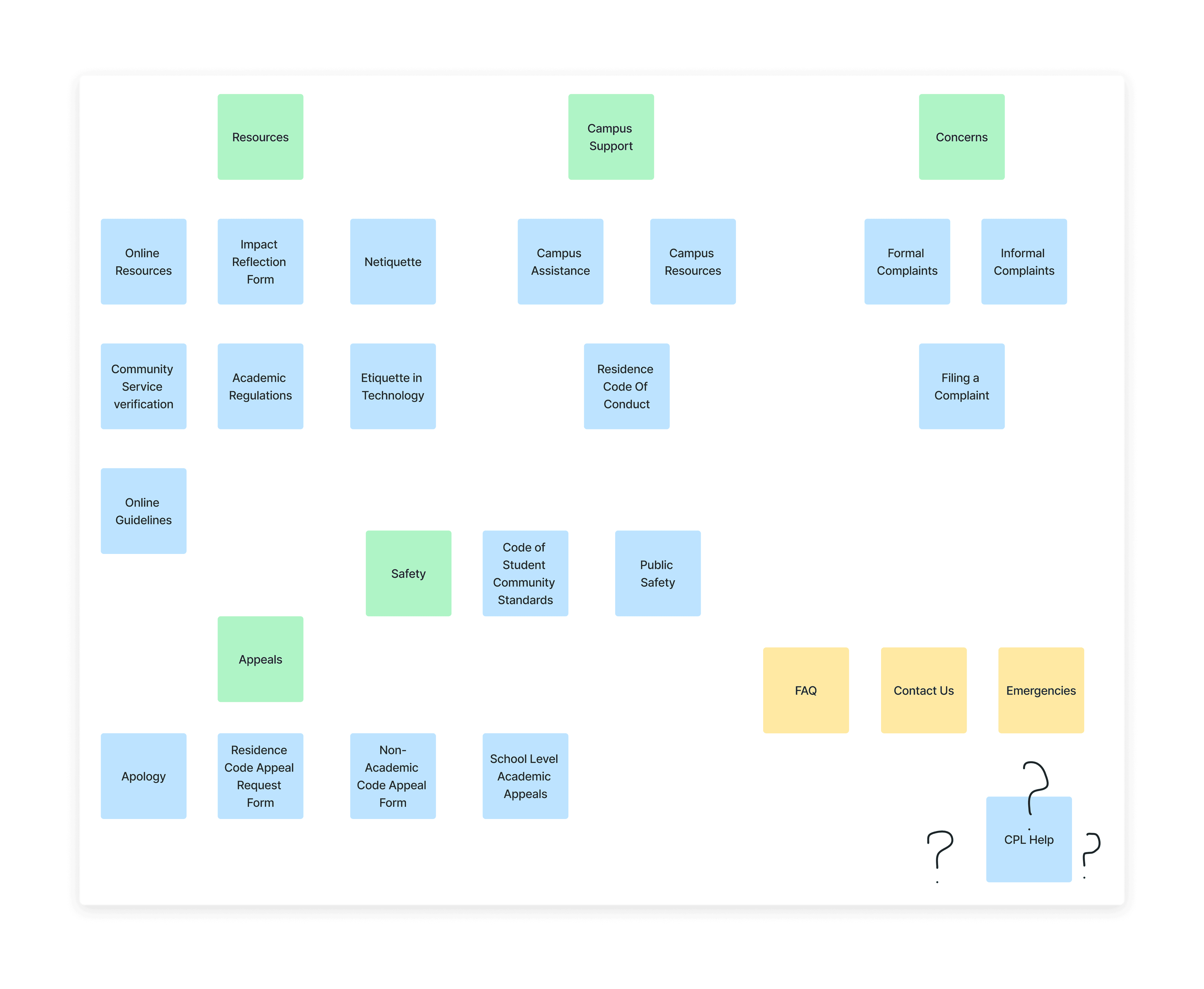
Reorganizing The Site (Information Architecture)
Using the card sort and initial research, we created a new IA (Information Architecture). In this IA we were able to explore the new and clear hierarchy of the site that both targeted the user needs and addressed the business goals.
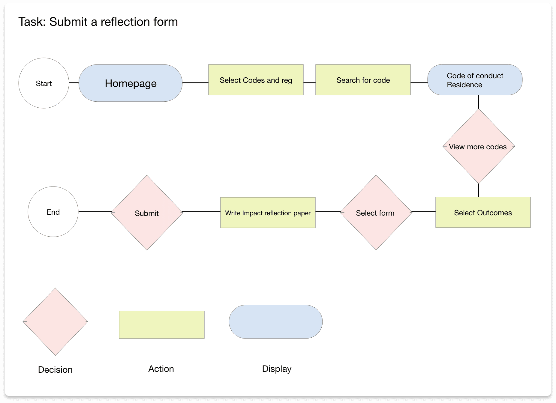
User Flow and Task Flow
With this IA, I created a user flow and task flow to understand the route a user might take and how they might interact with the content.
Task
Complete an Impact Reflection Form
Turing Our Ideas Into Visuals- Sketches and Wireframes
Having created the IA diagram and task flow, we moved on to sketching. This let us visualize the site's layout and content and quickly make edits based on feedback before moving on to final mockups.


Design- Style Tile
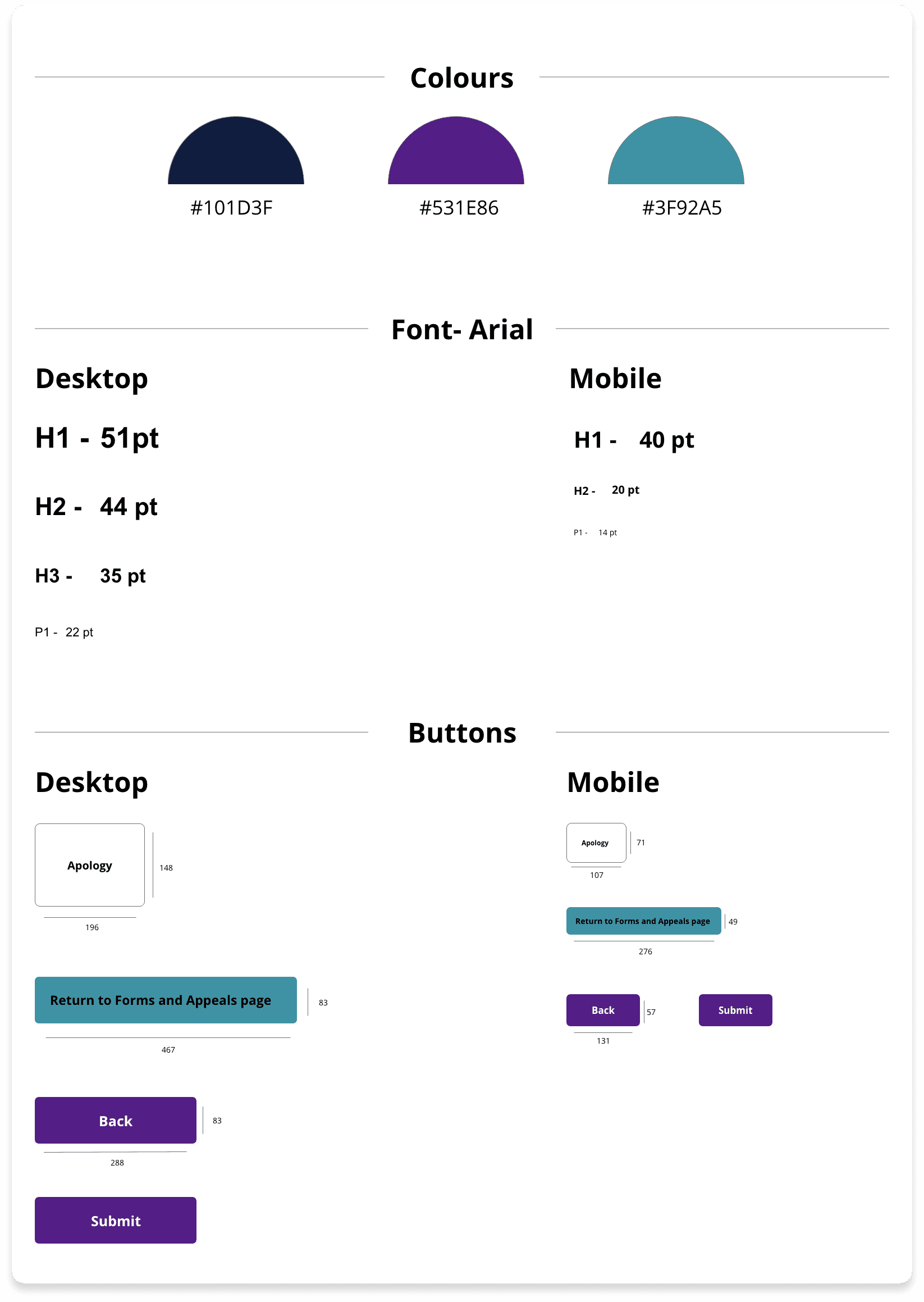
Our main objective in designing the site was to relay the information clearly and legibly so as not to overwhelm the user. We also wanted to create a proper hierarchy and a minimalist design structure. With that, I designed the following style tile, with updated typography and button stylings, while keeping the branding and colour schemes of the original site for consistency.
Final Mockups


Next Steps
Since this was a short project, we did not have time between the stages to user test, so my next step would be to test the design with the target audience through usability testing. The feedback would be used to iterate on the designs further.
Measures of Success
There were no quantifiable metrics for the redesign, but final presentations were held with the internal stakeholders. We explained our reasoning, addressed the problems and discussed the solutions that targeted them. We wanted to show them the process of how we uncovered the solutions through research and ideation, anchoring the solutions to the problems. By the end, the stakeholders gave good feedback and highlighted areas of opportunity.
Final Thoughts
Though there were many bumps in the road with this project, I can happily say we got through most of them. I think something this project taught me was how important communication is and advocating for the user- many of my teammates were from different disciplines and were unsure of how to start the project, or suggested plans that left out the user. This helped me practice my skills in explaining the design process when presenting, advocating for the user, including feedback, and relying on a team to carry the project to the end. Looking back, I don't think I'd change anything about the process because it was an important learning experience.
Up Next: Sofia Catering

Thanks for stopping by!