
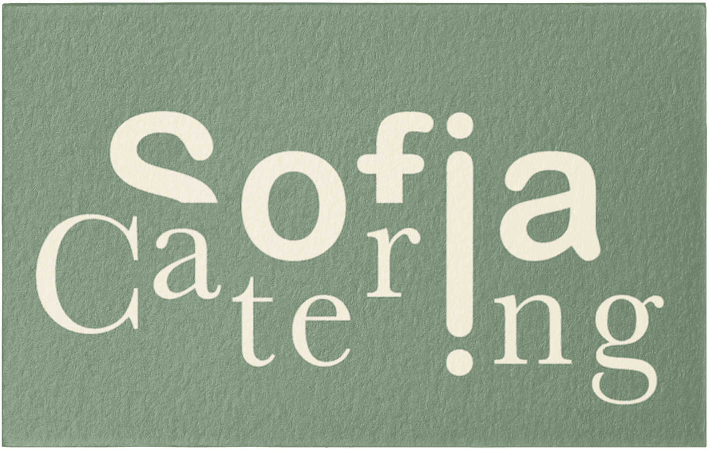
Sofia Catering
This project was centred around a client's private catering business. They contacted me to help bring their vision to life through their business cards. I was given a lot of creative freedom, but they requested the cards to be green (close to an olive green) and have an element that tied into the cooking theme.
Brainstorming/Sketching
I drew some quick sketches and asked which ones stood out the most. Three were picked:

Font Style
I went through fonts and chose ones that not only matched the sketches but also went well together. During this process, I looked for fonts that were inviting and clean.

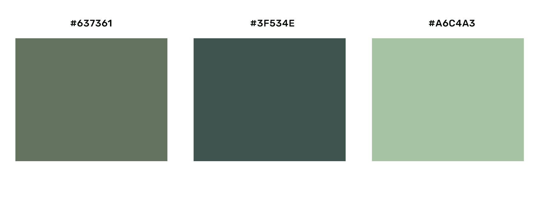
Colour Selection
Green is a colour that evokes feelings of harmony, tranquillity, and peace and is one of the most soothing colours to the human eye (Braam, 2024). Updating my client, I showed them three shades of green and asked them which they could envision with their brand (and let them know they could not like any and I'd find different shades). They were instantly drawn to one of the shades (I think I introduced them to a new favourite colour).
The Cooking Tool
I played around with some vectors in Illustrator, but didn't like how they turned out. It was when I was sketching new tools that I drew a rolling pin and found that it resembled two i's joined together. So, I went back in Illustrator and did just that. Referencing the sketches, I thought using this i in place of the I in Sofia and Catering (joining them) would help to tie the two words together and add a strong visual element to the card.

Layout
For the face of the card, I went with a scattered layering of the letters for uniqueness and to play into the idea that cooking has many steps/disciplines.

Style Tile

Takeaways/ Feedback
So initially, the client was a bit unsure about the layout of the words on the face of the card, and I asked them for feedback and told them I could make iterations, but after a day, they came back to me and said that they liked the design and vision.
This project showed me that I needed to refresh on visual design principles and keep practising. But this was a fun project, and it reminded me that things are rarely done perfectly the first time, and that's why there's testing and iterations and feedback

Up Next: Thesis Capstone


Thanks for stopping by!